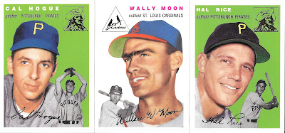
1954 Topps Archives is a reprint of the original set that makes me wish I would have been alive back then to collect the original. It's eye popping colors and action inserts, along with the old school logos and glossy card stock really make this an attractive set. I never really gave it any thought until recently when MLB started to threatened a revised schedule if a contract isn't reached soon. So instead of focusing on current players, I thought it would be nice to blog about the good old days.
Though I had seen the packs of this back in 1994, it was the 1953 Topps Archives that I really paid attention to (and they also seemed to be everywhere). So when I came across this set I didn't hesitate to pick one up as I just didn't want to waste money building a set buying packs. Back then I considered this "just another reprint set" and promptly shove'd it onto a shelf where it disappeared into the card void that is my closet.
The set consists of 259 cards, with many hall of famers and eight additional "cards that never were". Harmon Killebrew was one of those cards that Topps whiffed on back then.
If there is one thing that annoys me about the set, it's that the card backs don't all align the same way. I don't know if that is how it was done with the original set (I don't own many 54's), but I don't like it.
There is also a parallel gold foil set. It doesn't really show up in the scan but you can compare how the foil logos scanned versus the regular issue cards. Whoever the person was that put together the set I bought used foil parallels for about 20% of the set. Making it tempting to hunt a parallel set.
There are 3 unique cards in this set. First, Mickey Mantle is one of those "cards that never were" and apparently is a SP. As were the Ted Williams cards.
If you read the fine print you'll know why. Both of these players were under contract with Upper Deck at the time this set was released. According to
Basecardpedia, these cards were printed to match the same stock as Topps, but were released in UD's All Time Heroes set. At least UD aligned the card backs the same direction.
At first glance on ebay, it seems this set has gained in popularity over the years. I come across a few of these cards at shows and other than the 3 UD prints, completing a set doesn't look impossible. This set should appeal to any fan of baseball's golden years (well, any fan of baseball) and will always have a spot in my collection.


The original 1954s had weird backs like that. Now that I think of it, it would've been cool if they'd changed it.
ReplyDeleteI have some of those 54 Archives, and like them. Not as nice as the originals, but very cool.
UD printed cards in a Topps design, as an addendum to another Topps set? Wow, that is interesting! I was too young to appreciate the Archives set when it was released but I do have a few singles, mostly Red Sox. There's a Roberto Clemente Dodgers card in this set, am I right? Or am I thinking of something else?
ReplyDeleteI purchased a big lot of these from a friend who was a TTM guy, so all of the ones I own are signed. I rarely ever come across the 1994 Topps Archives cards in the wild, but as you mentioned... the 1993's seem to be everywhere. I think it's cool that Upper Deck helped out fans of this set by creating cards of Williams and Mantle. Kudos to them for being willing to do it... and kudos to Topps for allowing them to.
ReplyDeleteI've never collected this one, but have seen some completed sets on eBay over the years. And every time I do, I'm always amazed at how much they're selling for.
ReplyDelete