The title for this post is a bit misleading so if you came here thinking about evolution and Darwin, sorry to disappoint. For those that like hockey, stick around because this set will take you back a few years. Released in 1994, Parkhurst decided they would get in the retro game and issue a set for the season they missed, 1956-57, thus the missing link.
The design of this set with the solid border on the left, will remind collectors of the 1992 release. Aside from the action photos, the most obvious difference between these sets is that the 1992 set had a prominent Parkhurst logo where the team logo is present in this set. Honestly I wouldn't enjoy this set if Parkhurst didn't include the team logo.
The border color matches the team's color, so that's a nice touch. The cut out of the players also reminds me of a more famous set, the 1954 Topps hockey set.
One of my peeves about this set is the landscaped shots. I find it annoying when you have to turn a card to view it properly. At least the 1992 set placed the border at the bottom of the card.
Manager cards are also included. I don't remember too many hockey sets with manager cards.
There are a few full color action shots, which are pretty cool. Ah, the good old days when there was no advertisement on the boards.
I really like this shot of Plante making a nice save. The background in these are always neat to check out and given the shadows in the background, stadium lighting sure has improved since then.
A nice shot of the champs being presented with the Stanley Cup. The highlight cards shifted gear in border design, placing it on the right side of the card, another peeve of mine.
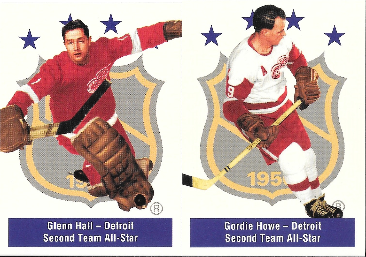
The All-Star subset cards are pretty cool too. Hard to believe Gordie Howe was
only a second teamer.
There's also a subset of the trophy winners. This is how the whole set should have been designed.
The back side of the card. Rather plain and dare I say dull? All that french takes up too much space.
The tally card! Ok, it's just a checklist, but you get a french lesson too.
So this set really doesn't qualify as a reprint set, even though it features players who have mostly passed on. Overall the design is good, and the cards are printed on something similar to good old fashion cardboard (but not quite the same as vintage cards), not the flashy stuff you see nowadays. Hockey aficionados will appreciate this set like I do and Darwin might appreciate that hockey evolved to include helmets.
More cards to giveaway :)


This set has been the subject of numerous blog posts over the years, and even though I don't collect hockey, I do like the set, if only for the concept alone. The action shots are really great too, I'm sure that a lot of hockey aficionados probably would've liked to see more of those in there.
ReplyDeleteI really like this set. The set design is simple and the checklist is strong. Bought a large starter lot at the flea market a few years ago and had some help from a fellow blogger to get me close to completing it. The final cards I needed were picked up off of Sportlots.
ReplyDelete