I've returned from my annual fishing excursion with some friends. Like clockwork on these trips, we always get to reminiscing about the past and things that we could 'get away with' back then that most young people today wouldn't understand. Things like running amok in a neighborhood for a whole day. No parents, no chaperones or babysitters and certainly no phones. Just kids being kids, exploring places in the big city and getting into and out of trouble. We could run around all day as long as we were back in time for supper. I can still hear my mom yelling for me when it was time to come in. I could be blocks away, far out of hearing range and yet somehow, someway, word would get to me that I had to go home.
I guess the term used nowadays is 'free range parenting'. My folks and that of many of my friends, certainly embraced this style of parenting back in the 70's. Most of my 'free ranging' experience came in the latter half of the decade. And I took full advantage. Especially when my paper route check was cashed. I would head to the local store to see if any sports cards were left for me to buy.
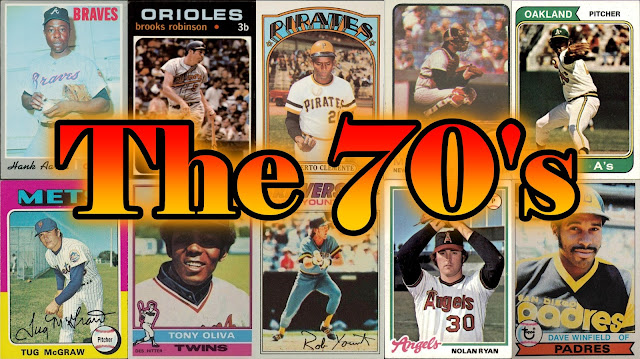
Since my collecting habit formed in the late 70s, it took me awhile to be introduced to the different years of cards and I really never appreciated the different designs for each year. So for this post, I thought I'd lay out in order of how I perceive card designs of the '70s from worst to best. I know the blogosphere is laden with rankings and these can be highly subjective. I'm not ranking the sets (though I'm not sure if this would change my order). This is about card front design only.
So here we go.
10: 1973
I really don't like this design. It's always struck me as rather boring. Some folks may rank this design higher simply because of the player icon but overall I find this to be rather blah.
9: 1979
The era of the trademark has begun. This is really similar to '76 and kind of a lazy design. Blah.
8: 1977
I want to rank this design higher, I really do. I've always liked cards with facsimile signatures, but in this case it doesn't do much to increase the appeal of this design. Neither does the flag with the player's position. The flag kind of clashes with the overall look. It clashed so much, a neighborhood friend spent hours cutting that flag away from his stash of '77s. Maybe that's why I rank this so low.
7: 1976
Another design with a player icon, but that's not why this is placed in the lower tier. I actually think that player icon is an improvement over the '73 set. Other then Topps attempting to color match with the team's colors, this design really doesn't offer much else.
6: 1974
The double banner look is kind of neat but then you get to those landscaped cards (Garvey, Fisk, Santo etc) and there's only one banner. I'm not sure why Topps decided to do that but I don't think anyone ever accused Topps of putting much thought into card design back then. Nevertheless, the banners were almost enough to get the '74 design into my top 5 for this decade.
5: 1975
Tough choice to put this design here. It's never really done anything for me but it is a colorful set. The dropped shadow team font helps a bit, the baseball in the corner showing the position is nice and the facsimile autograph add to the appeal.
4: 1972
The arched showtime font with stars really give this design a funky look. Which may be appropriate given the disco era. Nevertheless, it was tempting to rank this lower.
3: 1970
Many collectors think this design is boring. I get it. It's gray and reminds me of those gloomy overcast mornings when you sit around and wait for the rain. But that's not necessarily bad. This stands out as the only gray bordered set, and because of that the position, team and player names really pop. Even the photos seem to standout a bit more because of the border.
2: 1971
This design might be number one for most collectors. The black border really pops which makes the high contrast of the team and player name really stand out. The photos inset with a white border help to brighten the look of the card.
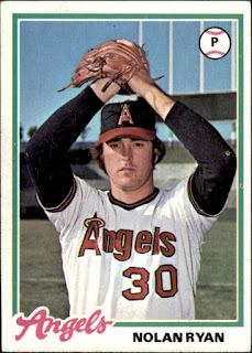
1: 1978
I am unabashedly biased when it comes to this design. These are the first cards I ever bought and so remain close to my collecting heart. Most collectors probably feel the same way with their first set. But the simplistic design here with the scripted font makes this a design that would fit in any era. Throw in the all-star badge or a rookie cup and you've got an all-time classic.
Ok, there it is, Crocodile's first ever ranking. I have no intention of making up rankings for each decade, but in this case I thought it would be a fun exercise as I'm trying to complete all of these sets.
Now it's time for Crocodile to get some lotion to ease the sunburn acquired last week.


I totally agree with you about '73, it's one of my least favorite flagship sets ever. Disagree about '70 and 78, however. I'd rank those near the bottom. '75 and '71 are probably my two favorites, with '74, '76, and '77 rounding out the top five.
ReplyDeleteThat said, I was born in '80 and didn't buy my first pack of cards until '86. So what do i know? :D
My faves in order of front design fave to worst would be
ReplyDelete74, 72, 75, 71, 78, 76, 77, 70, 73, 79.
I would reverse 1 and 2 but glad both were high on list
ReplyDeleteLove rankings.
ReplyDeleteIn all the rankings of '70s cards I've seen -- and I just saw one last week -- I've never seen the 1970 set that high. It's usually 9th or 10th.
I've always like the '70 set. Not sure why others rank it so low.
DeleteI was born toward the end of the 70's so I didn't experience these sets until later on. I love '73 but that's more for the content of the photos than the border design. My favorite is '71, I love the way the team and player name look against the black background. '77 is probably my least favorite, seems to have the least amount of room for the photo.
ReplyDeleteOh yeah, I'd be out of the house by sun up, not to return most days until supper or dark. Walked everywhere until I got a bike then rode. It was great.
ReplyDeleteTo each his own, right? Fun post!
ReplyDeleteI love ranking posts... and seeing how others view card designs. As for the 70's... it's loaded with some of my favorite designs. Here's my Top 5: 1972, 1975, 1976, 1973, and 1974... but I really like 1977 and 1978 too.
ReplyDeleteThe designs from '76 to '79 are some of my least favorite of al time. '74 was pretty boring too.
ReplyDelete*all time
DeleteI've been thinking about this for a while and I think your ranking is pretty close to mine with the exception of the '73 set, which is one of my favorites. While I never bought that set in packs (I was 6 when it came out), I did end up having a shoebox full of them along with some from '71 that I bought at a garage sale in the mid-70's some time, so there is some nostalgia there for me. 1978 is the first year I regularly bought packs but despite that, I'd put the '71s at #1. And I'd bump the 1970 set to #10. I just find it quite boring. I'm curious how you'd rank the sets from the '60s!
ReplyDelete